Radio buttons should always have exactly one option pre-selected.
The main guideline for radio button design is to select one of the radio buttons by default (i.e., when the page loads, in the case of a web application.) This is good usability and elegant design. I say this not because I am waving a banner for traditionalism, or even for consistency. Rather the banners I’d parade in this case would be decorated with concepts such as the following:
user control,
expediting tasks, and
the power of suggestion.
Radio button groups should always have exactly one selected item. So, that would mean that you should indeed select one of the items. What is the meaning of a group of radio buttons without a selected item? However, for a yes-or-no question, I don’t think a radio button is the right control to use. Instead, use a check box. —–Chat GBT?
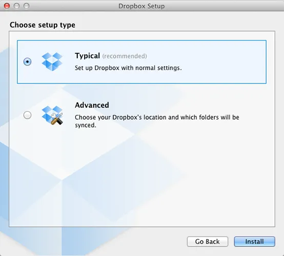
Dropbox
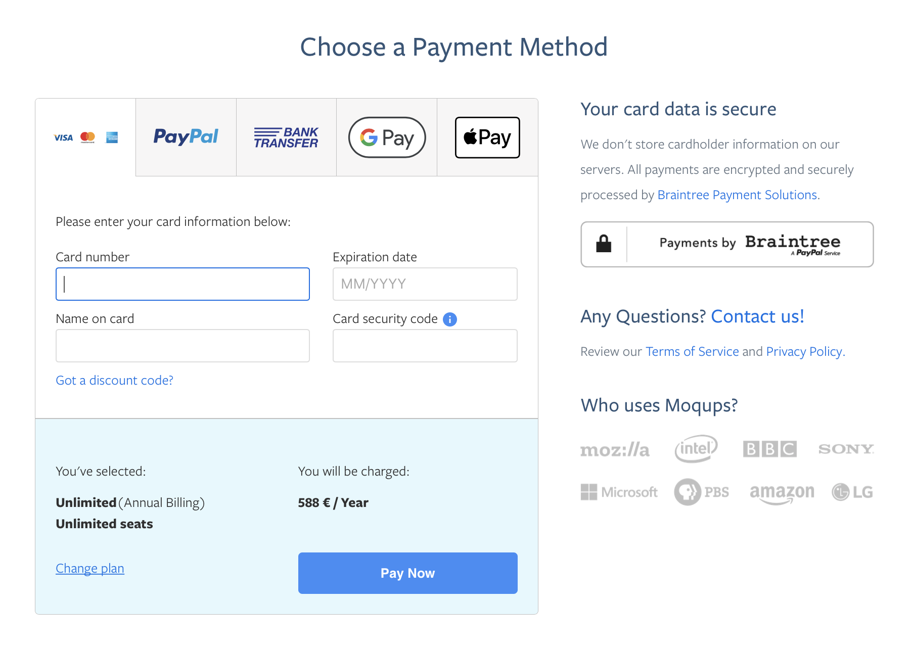
Payment example
Payment example
Dropbox example
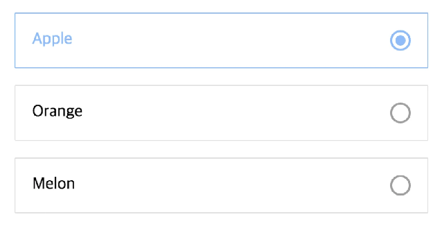
Pre-selected
Not selected
Vertically (example)
non-vertically / Horizontal (example)
Rule 2:
Lay Out Your Lists Vertically
The main guideline for radio button design is to select one of the radio buttons by default (i.e., when the page loads, in the case of a web application.) This is good usability and elegant design. I say this not because I am waving a banner for traditionalism, or even for consistency. Rather the banners I’d parade in this case would be decorated with concepts such as the following:
user control,
expediting tasks, and
the power of suggestion.
Rule 3:
List them in a logical order (from easy to complex)